The demand for cold brew appears like it's only going to grow—and so is the competition. If you want customers to pick your brand out of all the other options, you’ll want to have some eye-catching cold brew packaging.
So we’ve got some cold brew design ideas to help jog your creativity.
How to Package Your Cold Brew Coffee
Bottles
Holding an ice-cold bottle of cold brew does carry a certain appeal. And a clear bottle allows people to see the rich colors of your coffee before they buy. You may also choose different shapes to give your cold brew design a unique look. But glass bottles can have their drawbacks. They’re typically more expensive, harder to recycle, heavier, and have a greater environmental impact.
Cartons
Cold brew cartons can be made from recyclable materials, and they’re lighter than glass bottles—which can be better for the environment and your shipping costs. They can also stand out on the shelf, though you may need to be a bit bold in the design to show people that there’s coffee in there, since cartons can be a less conventional option.
Cans
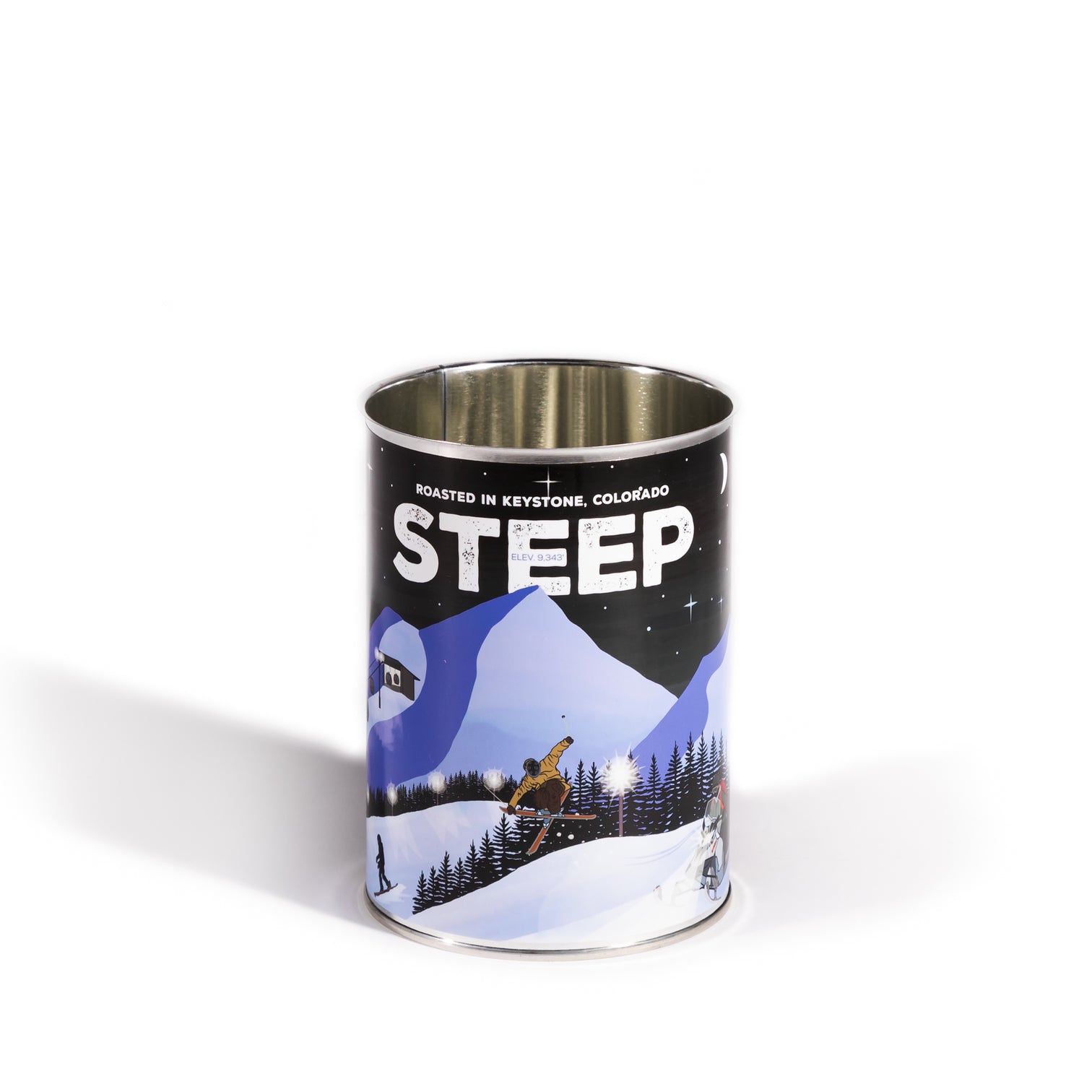
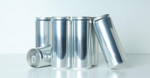
While cans don’t allow the customer to see the product for themselves before they buy, the lack of light penetration protects the contents. They’re also lightweight and easily portable, and they’re environmentally friendly since they don’t require a lot of energy to recycle. Plus, cans provide plenty of canvas for a standout cold brew coffee label design.
Cold Brew Coffee Label Design
We can’t give you the exact formula for a surefire hit, but we do have plenty of cold brew packaging ideas that will help you come up with the design that’s right for your beverage.
Color
If only the color of your cold brew label design could convey the smooth, rich flavors of your coffee. But what color should you choose? Brown, and its countless creamy variations, is right there. Brown can be helpful if your cans need to stand out from soda cans, energy drinks, and fancy, flavored water cans on the shelf.
But brown can also let your cold brew design blend in with the competition. Pun not intended. We like the vibrant blues of La Colombe or the cool pastels of Pop & Bottle. Packaging that centers on one color can lend your can a modern appeal, while mixing contrasting colors can emphasize different flavors or types of cold brew.
Despite their affinity for green, Starbucks really loves using browns in their coldbrew coffee designs. But they rarely stick with just one shade. When you have so many products on the market, you need to find ways to differentiate them from each other. Their cans mix Starbucks’ recognizable green logo with blacks, browns, and tans.
On the other side of the Pacific are the equally iconic designs of Japan’s Boss Coffee. While they make great use of browns and blacks, their Rainbow Mountain Blend just jumps right out at you. It’s a drink that almost demands that you at least try it.
Graphics
Color may be the first thing that people notice when they see your cold brew, but the graphics and design are what will really speak to them. Your choices run the gamut from cool minimalism to youthful energy. Verlé’s designs exist on the far edge of minimalism in a “we’re so cool we don’t need to market ourselves” kind of way. While COTD stretches its letters just as far as they’ll spread across the can to make sure you know the name.
Your inspiration can also come from a wide range of sources, and they can reflect the type of audience you’re looking to attract. We like NOBL’s website-inspired, sans-serif look, while we also appreciate Lacas Coffee Co.’s juice-bottle-esque design. One may be great for roping in an audience looking for rich sophistication, while the other may connect with consumers who are used to buying health drinks.
Information
Another key factor to consider when choosing your colors and designs is how the information about the product and your business will be presented to the customer. This is another great opportunity for cans, since they have a larger canvass to work with and you can fit more text. You can use this as a way to tell people about your business’s history, your approach to making great coffee, and what kind of flavor they can expect from your beverage. It’s also a great space to change up the design for seasonal events or advertisements for other products.
This is an area where Monster Energy has been able to build its brand identity and create a unique message for each flavor of Java Monster. Starbucks takes the opposite approach, and leaves as much open space on the clear glass bottles of their frappuccinos as they can, in order to showcase the creamy coffee inside.
Need Cans with Custom Labels?

Once you have your label designed, we’d love to put it on a can and ship it to you. Oktober offers custom labeling services for 8 to 32 oz cans, including both gloss and matte finishes. We can supply a size for the template, and once you send us the design, we can typically have it ready within two weeks. Our cans come with standard B64 ends, though SuperEnds and Crown 360 Ends® are also available.
If you’re looking to can your roasted coffee beans, we also sell labeled 401 x 508 and 401 x 700 steel coffee cans, along with vented foil ends.


